Introduction
The old saying "don't judge a book by its cover" is completely ignored by readers. In the digital age, your cover is the single most important factor in whether a reader clicks on your book. However, cover design principles vary drastically depending on whether you are publishing fiction or non-fiction. Understanding these differences is key to capturing the right audience.
1. Fiction Cover Design: Emotional and Atmospheric
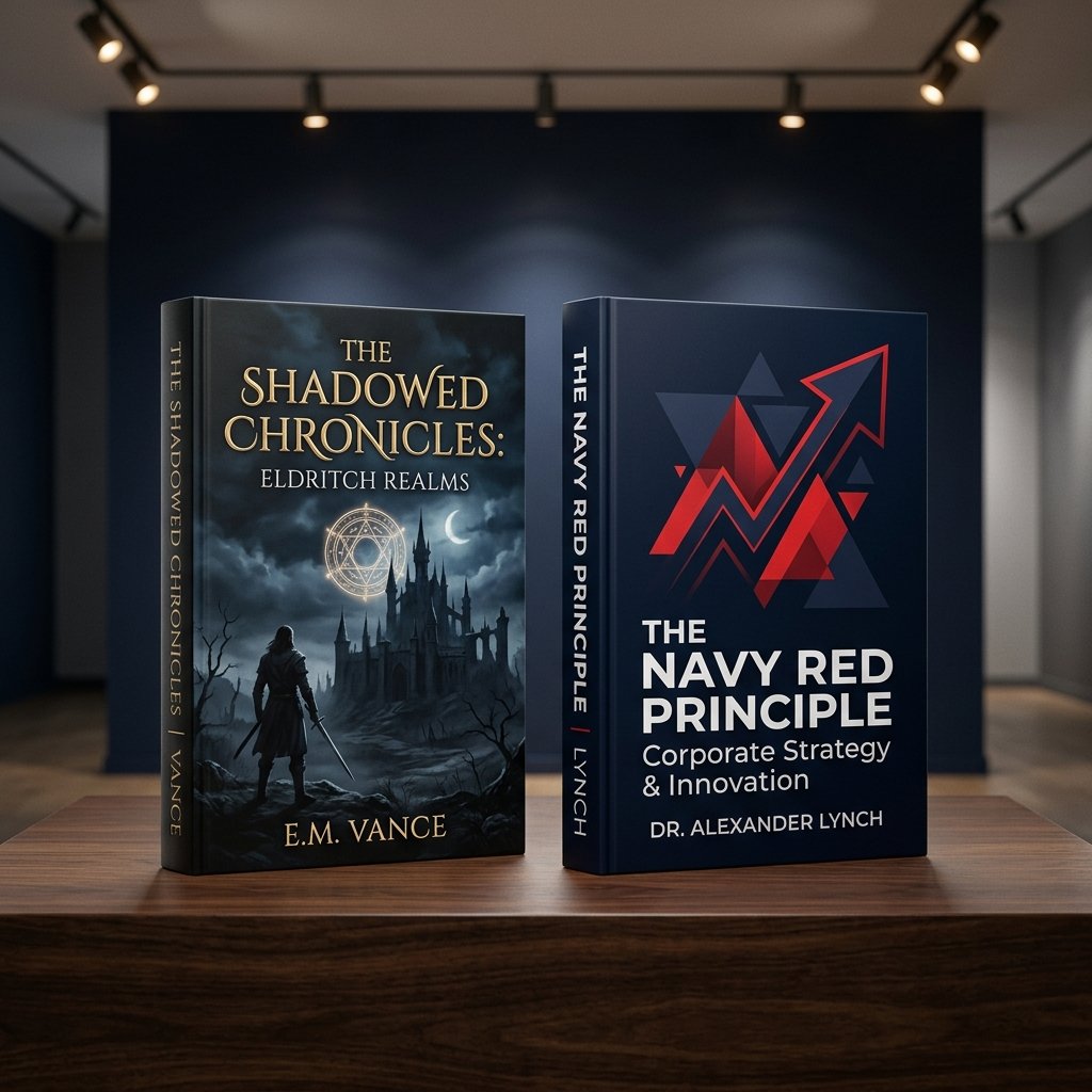
Fiction covers are about mood, emotion, and storytelling. They should transport the reader into your world. Best practices include:
- Imagery: Show characters, atmospheric landscapes, or symbolic objects that hint at the plot.
- Typography: Font styles are highly genre-specific (e.g., elegant scripts for romance, distressed sans-serifs for thrillers, or glowing serif fonts for fantasy).
- Colors: Rely on rich gradients and high contrast to set the mood (e.g., dark blues/purples for mystery, bright warm colors for romance).
2. Non-Fiction Cover Design: Clear and Benefit-Driven
Non-fiction covers are about solutions, clarity, and authority. The reader wants to know exactly what they will learn. Key elements include:
- Typography: Big, bold, clean, and highly readable fonts. The title should dominate the cover.
- Imagery: Minimalist graphics, clean lines, or professional portraits of the author. Avoid complex or cluttered designs.
- Colors: Corporate and trust-building tones (navy blue, solid white, bold red/yellow accents).
"A fiction cover sells a dream; a non-fiction cover sells a solution."
Conclusion
Whether you write sci-fi thrillers or business guides, your cover must align with reader expectations in your genre. Partnering with a professional designer is key. At American Author Hub, our award-winning designers create covers that hook readers and drive sales.